Investors see a lot of decks. The ones that work aren't the flashiest; they're the ones that are easy to follow. A good structure does half the persuading for you, because every slide answers the question the audience is already asking.
Here are the 12 slides most strong pitch decks share, in an order that builds naturally from "why should I care?" to "how much do you need?".
- Keep the main story to about 12 slides and move details to an appendix.
- Follow the audience's questions: problem, solution, market, money, proof, people, ask.
- Write each slide title as the takeaway, not a label.
In this guide
01The 12 essential slides
The whole deck at a glance (example layouts from MEGGYSTUDIO templates):
 01Title
 02Problem
 03Solution
 04Product
 05Market
 06Business model
 07Traction
 08Competition
 09Go-to-market
 10Team
 11Financials
 12The ask
01Title
Company name, logo, a one-line description of what you do, and your contact. The one-liner matters most: if someone only reads this slide, they should know your category.
02Problem
Describe a real, painful problem for a specific group of people. Use a short story, a quote or one strong number. Avoid listing five problems; pick the one you actually solve.
03Solution
How you fix that problem, in plain words. One sentence and one visual beat three paragraphs. This is the moment the audience should think "oh, that makes sense".
04Product
Show it. Screenshots in a laptop or phone mockup, a short demo flow, or the three key features. Focus on what the user gets, not how it's built.
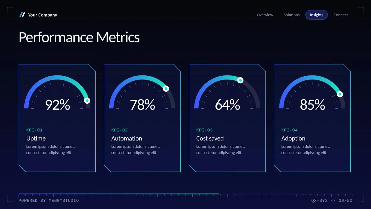
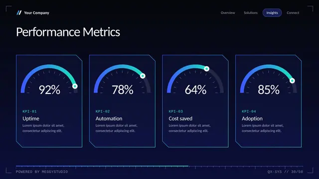
05Market size
How big is the opportunity? Many decks use TAM, SAM and SOM. Whatever method you choose, show your math and source, and be realistic. A believable small number beats an inflated big one.
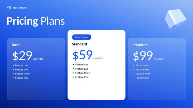
06Business model
How you make money: subscription, transaction fee, licensing, ads. Add the price point and, if you have them, unit economics like customer acquisition cost and lifetime value.
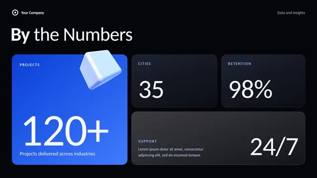
07Traction
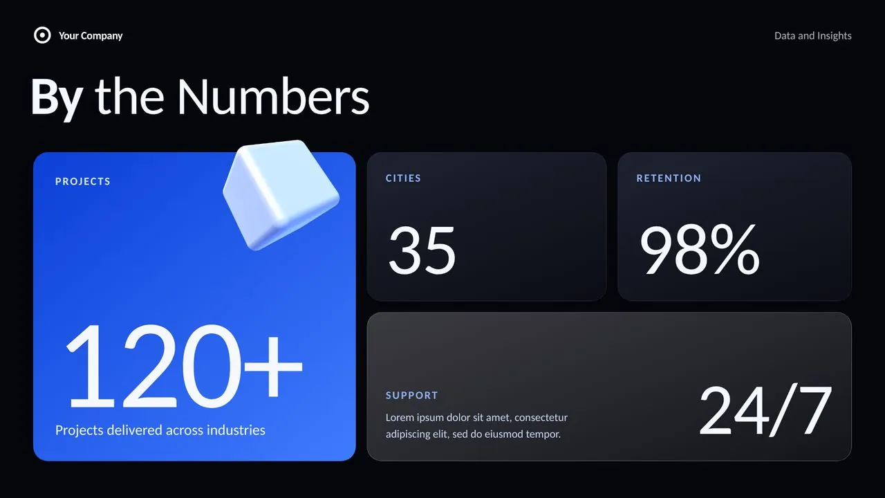
Proof that it's working: users, revenue, growth rate, pilots, partnerships, waitlist. One chart that goes up and to the right is worth more than a table of every metric.
08Competition
Every business has competitors, even if it's "doing nothing" or a spreadsheet. A 2x2 positioning chart or a comparison table shows you understand the landscape and where you win.
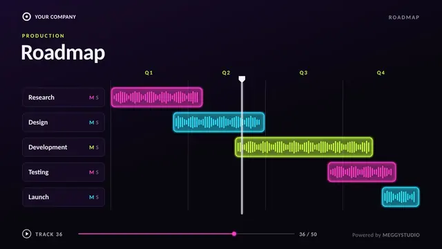
09Go-to-market
How you'll reach customers: channels, partnerships, sales motion, first target segment. Investors want to see a focused plan, not "social media and word of mouth".
10Team
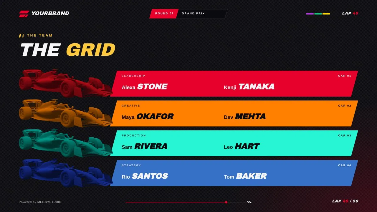
Photos, names, roles and one line on why each person is right for this. Highlight relevant experience, not every past job title.
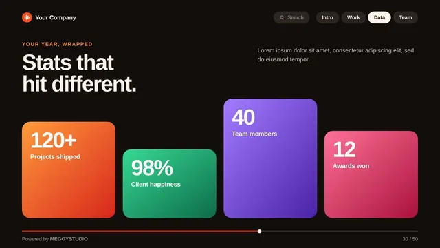
11Financials
A simple 3 to 5 year projection: revenue, costs, and when you expect to break even. Keep the detailed model in a spreadsheet; the slide just shows the shape.
12The ask
How much you're raising, what kind of round, and what the money will achieve. Split it into 3 or 4 uses (product, hiring, marketing) and tie it to milestones.
02Why this order works
The structure follows the questions people naturally ask: Is this a real problem? Can you solve it? Is it big? Can you make money? Is it working? Why you? What do you want? If you answer them in that order, the audience never feels lost.
03Design rules that keep investors reading
- One message per slide. Write the takeaway as the slide title, like "Revenue tripled in 6 months", not just "Revenue".
- Big type, few words. If it doesn't read on a phone screen, it's too small.
- Consistent layouts. The same grid, colors and fonts on every slide make you look organized.
- Show, don't list. Charts, photos and mockups beat bullet points.
- Smooth flow. Subtle transitions like Morph help one idea lead into the next. Here's how to use Morph.
045 mistakes that lose the room
- Starting with the product before anyone understands the problem.
- Market slides with huge numbers and no source.
- Walls of text the presenter reads out loud.
- Forgetting the ask, or making it vague.
- A deck that looks different on every slide.
05What goes in the appendix
Detailed financials, extra customer case studies, technical architecture, cap table, product roadmap and FAQs. Keep them after the closing slide so you can jump there when someone asks.
06Build it faster with a ready-made structure
Every MEGGYSTUDIO template already includes these slide types and more: problem and solution, market, roadmap, big numbers, charts, team, pricing, case study and a closing call to action, across 50 layouts. For tech startups, Quantum Tech and Cyber Tech fit naturally; for a cleaner look, try Liquid Glass or Corporate.
50 slides covering every section above, Morph built in, Office fonts only.
07FAQ
How many slides should a pitch deck have?
For a live investor meeting, 10 to 15 slides is a good range. Keep the main story to about 12 slides and move extra detail into an appendix you can open when someone asks.
What is the best order for pitch deck slides?
A proven order is: title, problem, solution, product, market, business model, traction, competition, go-to-market, team, financials, and the ask. Lead with the problem so the audience cares before you show the product.
Should I send the same deck I present?
It's better to have two versions. The presented deck is visual with few words because you're talking over it. The send-ahead deck needs more text so it makes sense without you in the room.
Written by MEGGYSTUDIOWe design 50-slide PowerPoint templates with Morph built in.